Modernizing a Carbon-based Application UI
A redesign of an enterprise Carbon-based product from v9 to v11, focused on improving structural clarity, reducing interface noise, and making daily workflows easier to scan and execute.

Project Overview
I led a full interface modernization effort across multiple releases. The work moved the product from inconsistent legacy patterns to a coherent system that better supported decision-making and execution at scale.
Working with product and engineering, I used user feedback and interface audits to prioritize the changes that would reduce friction fastest.
The Challenge
The redesign needed to:
- Establish consistency across all pages and components
- Improve user focus and reduce visual clutter
- Modernize the look and feel without disrupting established workflows
- Enhance usability and information hierarchy
My Role
As lead designer, I was accountable for:
- Analyzing the existing application for usability issues and inconsistencies
- Designing new UI components and layouts using Carbon design system
- Collaborating with developers to implement the new designs
- Conducting user interviews to gather feedback and iterate on designs
- Ensuring consistency and adherence to Carbon design principles throughout the application
Process
1. Initial Analysis and Problem Identification
I audited the current product to identify the highest-impact usability and consistency failures:
- Inconsistent UI elements across different pages
- Overuse of primary action buttons, causing user confusion
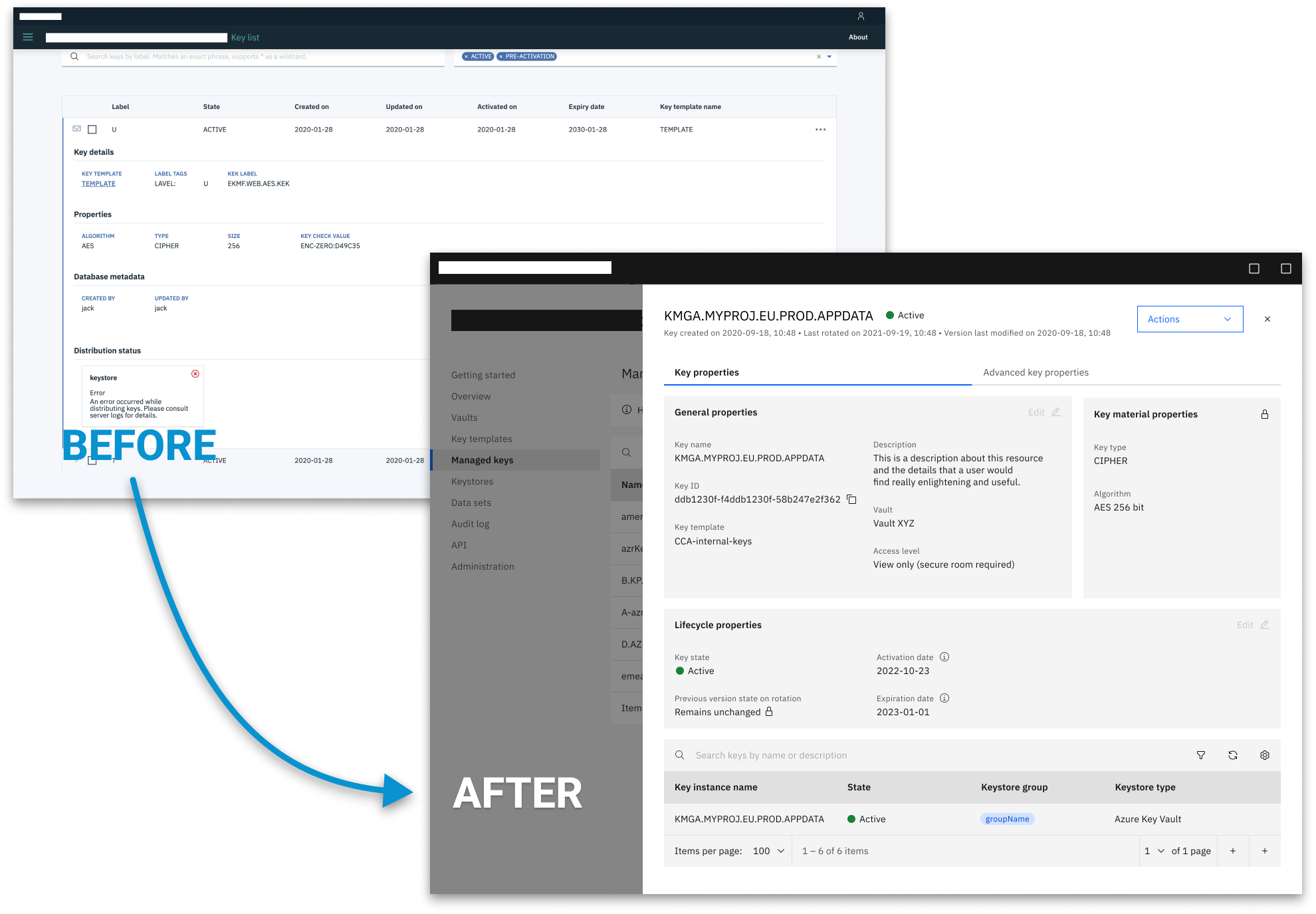
- Ineffective information hierarchy and data presentation
- Inconsistent search functionality and table layouts
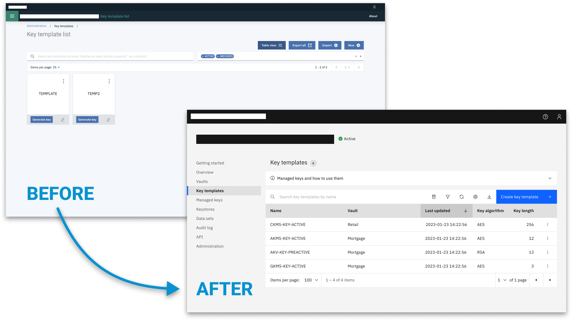
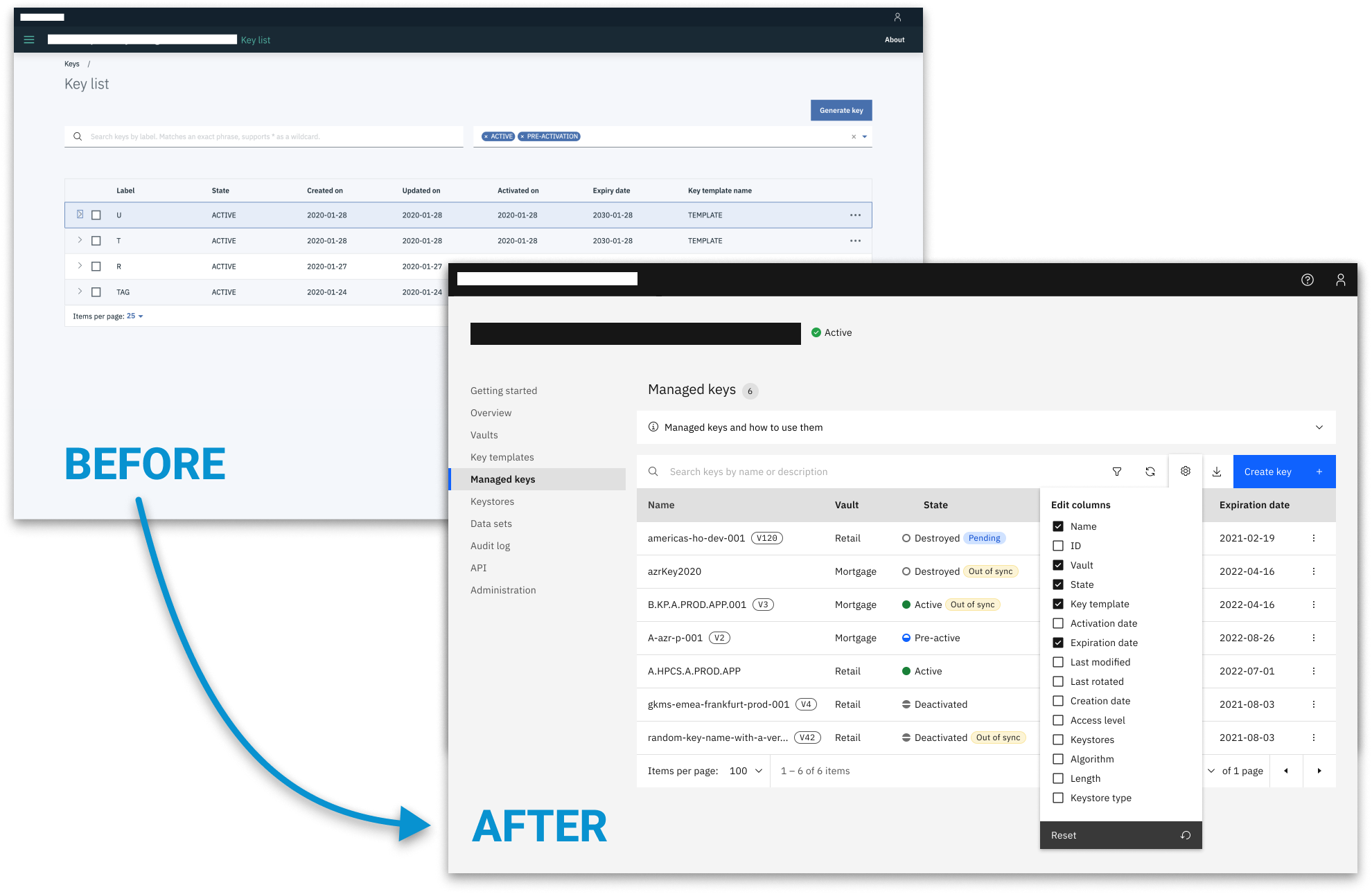
2. Redesign and Standardization
I then standardized core interaction patterns across the product by:
- Streamlining datatable views for consistency across the application
- Implementing a unified search functionality
- Redesigning card views for better information presentation
- Introducing selectable columns in datatables to cater to different user needs
3. Visual Modernization
The Carbon 11 migration was used to strengthen clarity and consistency through:
- Updating all UI components to the latest Carbon design specifications
- Ensuring a consistent and modern look across the entire application
- Refining color schemes and typography for improved readability and aesthetics
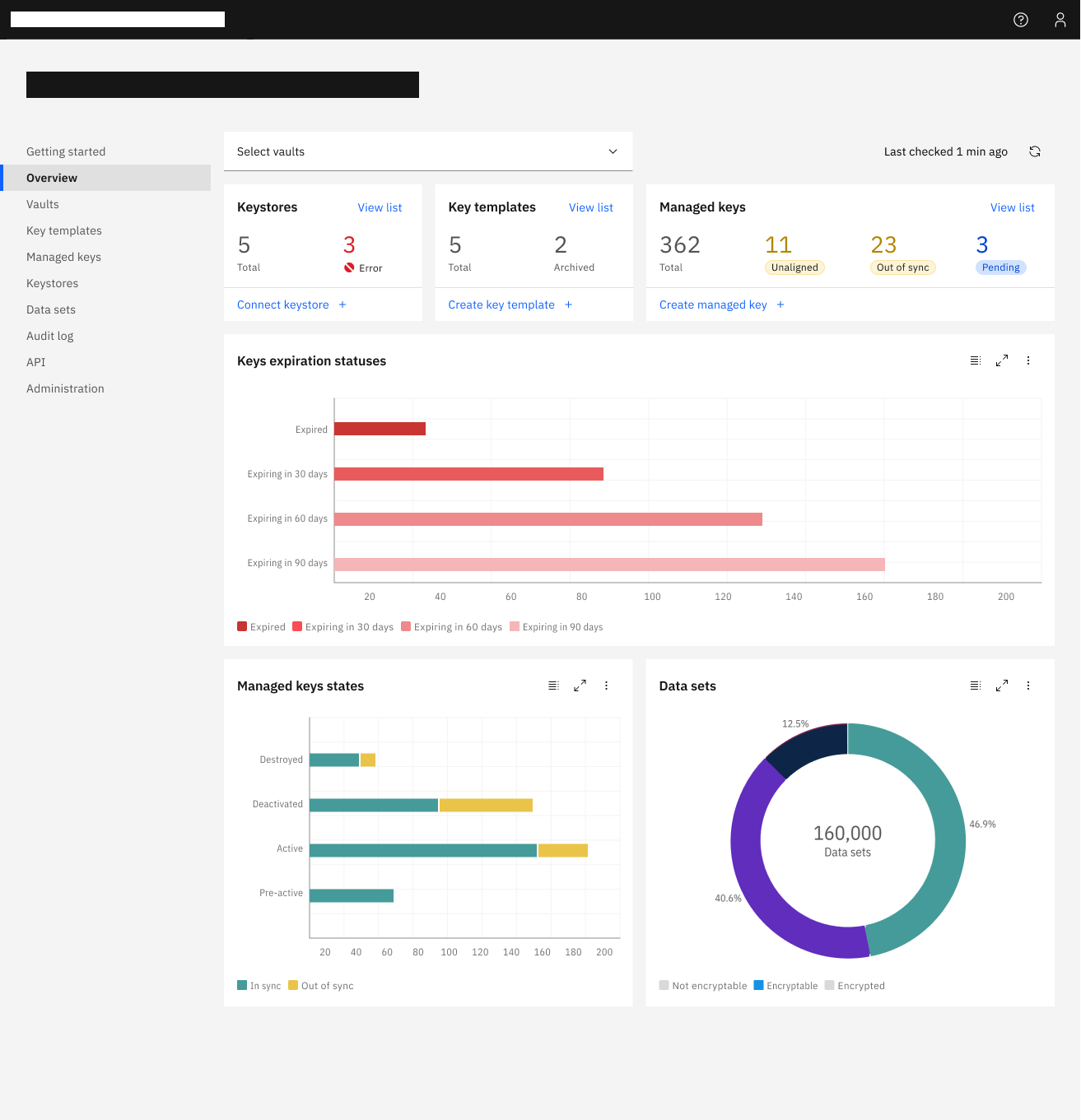
Outcomes and Impact
The redesign delivered measurable improvements in consistency and usability:
- Established a consistent user interface across all pages
- Improved user focus by reducing visual clutter and enhancing information hierarchy
- Modernized the application's look and feel, aligning with the latest design trends
- Enhanced user productivity through customizable data views and streamlined functionality
- Improved cross-functional alignment by giving product and engineering a clearer, shared interface model
Key Learnings
- The importance of consistency in creating a cohesive user experience
- The value of user feedback in identifying and prioritizing features
- The impact of information hierarchy on user comprehension and efficiency
- The benefits of following a standardized design system like Carbon
Conclusion
This project demonstrates how design leadership can modernize legacy enterprise products without disrupting operational continuity. By aligning UX decisions with system constraints and user priorities, we turned a fragmented interface into a reliable, scalable product experience.